 ChatGPT
 Claude
 Gemini
 Perplexity
Branding
Customize the visual identity, colors, logos, and terminology for your platform instance. These settings appear throughout the application and affect how your organization is represented to all users.
Overview
Navigate to Settings → Branding to configure:
- Organization identity — Company name, logos, and browser tab appearance
- Color scheme — Primary and secondary brand colors
- Login page — Custom headline and description text
- Terminology — Business terms used throughout the app (e.g., "Assessments" vs "Evaluations")
- Report builder — Custom names and descriptions for report sections
- Business rules — Employee count thresholds for company size classification
Changes take effect immediately after saving (the page will reload automatically).
Organization Identity
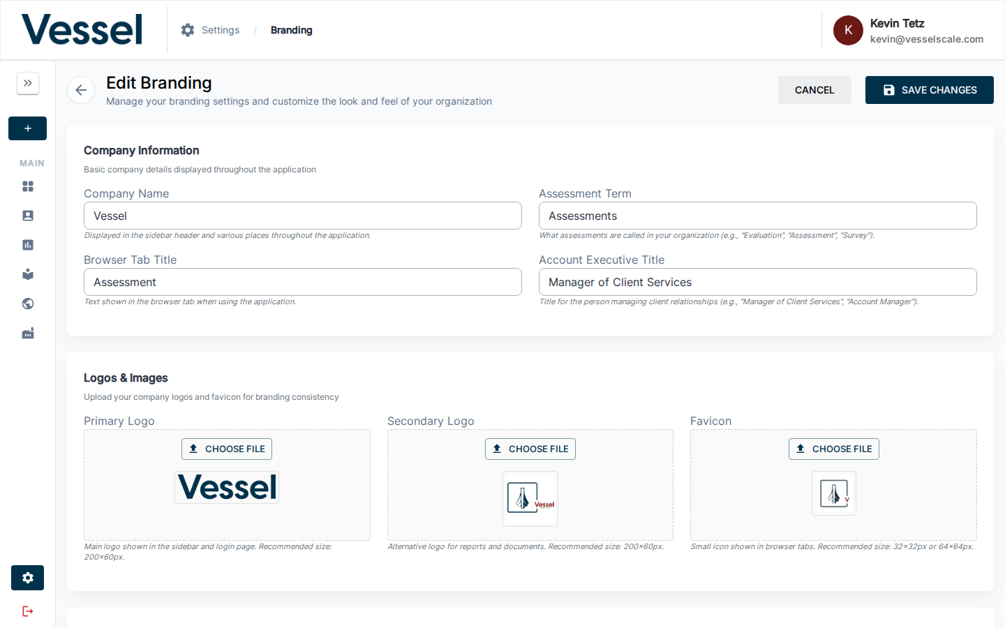
Company Name
The name displayed in the header sidebar and throughout the application. Leave blank to use platform defaults.
Primary Logo
Your organization's main logo, displayed in: - Header/sidebar - Login page - Navigation bars - Assessment pages
Recommended size: 200×60 pixels
Supported formats: PNG, JPG, GIF, WebP
Secondary Logo
An alternative logo used in: - Reports and document exports - Email templates (where appropriate)
Recommended size: 200×60 pixels
Favicon
The small icon displayed in browser tabs.
Recommended size: 32×32 or 64×64 pixels
Browser Tab Title
The text shown in the browser tab when users view the application. If not set, defaults to "Smart Assessment Platform".
Colors

Primary Color
Your brand's main color, used for: - Active navigation indicators (underlines, borders) - Accent elements throughout the interface - Links and interactive highlights
Format: Hex color code (e.g., #1976d2)
Secondary Color
An accent color for alternative states and emphasis. Used in: - Secondary buttons - Alternative highlights - Contrast elements
Format: Hex color code (e.g., #dc004e)
Header & Navigation
Header Bar Color
Customize the background color of the top navigation bar.
Use case: Align the header with your brand colors or dark theme preferences.
Format: Hex color code (e.g., #1e293b for dark blue, #ffffff for white)
Default: White (#ffffff)
Features: - Use the color picker to select a custom color - Hex input field for precise color codes - Predefined color swatches for quick selection
Tip
When using a dark header background, the breadcrumb and profile text theme (below) can be set to LIGHT to ensure sufficient contrast and readability.
Breadcrumb & Profile Text Theme
Control the color of navigation breadcrumbs and profile text in the header to ensure optimal contrast with your header background.
Options: - DARK — Use dark text/breadcrumbs (recommended for light header backgrounds) - LIGHT — Use light text/breadcrumbs (recommended for dark header backgrounds)
Default: DARK
Affected elements: - Breadcrumb navigation (shows current page location) - Profile menu text and avatar area - Active/inactive breadcrumb indicators
Color values:
| Mode | Active | Inactive | Separator |
|---|---|---|---|
| DARK | #1e293b | #64748b | #cbd5e1 |
| LIGHT | #ffffff | rgba(255,255,255,0.72) | rgba(255,255,255,0.48) |
Example: Dark Theme Setup
- Header Bar Color:
#1e293b(dark blue-gray) - Breadcrumb & Profile Text Theme: LIGHT
This creates a modern dark header with light text for high contrast.
Login Page Customization

Login Headline
Main headline displayed above the login form. Add a welcome message or organization name.
Example: "Welcome to the Smart Assessment Platform"
Login Paragraph
Description or supporting text displayed below the headline. Provide context about the platform or your organization.
Example: "Sign in to access assessments, reports, and performance insights."
Terminology

Customize business terms used throughout the application to match your organization's language.
Assessment Property Name
What the platform calls assessments. Default: "Assessment"
This term appears in: - Navigation menus - Page titles - Help text - Report headings
Examples: "Assessment", "Evaluation", "Review", "Survey"
Account Executive Name
The title for administrators managing client accounts. Default: "Manager of Client Services"
This term appears when displaying contact information and in admin descriptions.
Examples: "Account Manager", "Client Advisor", "Project Manager"
Report Builder Customization
When users build custom reports in the Report Builder, they work with sections organized by category. You can customize the names and descriptions of these sections.
Category Tab Names
| Default | Use Case |
|---|---|
| Strengths | Positive findings and capabilities |
| Gaps, Challenges, & Threats | Areas for improvement |
| Root Causes | Underlying reasons for challenges |
| Solutions | Proposed approaches to address gaps |
| Recommended Actions | Specific next steps and recommendations |
| Qualitative Insights | AI-generated summary of open-ended responses, editable by the report author |
To customize: Enter your preferred term or phrase for each category tab. The name you set here appears in both the Report Builder editor and in published Web Reports.
Category Tab Descriptions
Short help text displayed under each tab name in the Report Builder. These guide users on what content belongs in each section.
Examples:
- Strengths (default): "Highlight the team strengths for future success."
- Gaps, Challenges, & Threats (default): "Identify areas where team goals aren't met, cite specific opportunities, or discuss external risks."
- Root Causes (default): "Explain the underlying reasons for the challenges identified above."
- Qualitative Insights (default): "Summary of responses to open-ended questions in this category. Edit as needed."
To customize: Provide a brief, action-oriented description for each section.
Qualitative Insights
The Qualitative Insights tab is populated automatically from AI-generated summaries of respondents' open-ended answers. The tab name and description you set here appear both in the Report Builder editor (as help text) and in published Web Reports (as the accordion section label).
Business Rules
Company Size Thresholds
Define the employee count boundaries used to classify companies as Small, Medium, or Large.
| Setting | Default | Purpose |
|---|---|---|
| Small Company Threshold | 50 employees | Upper limit for "Small" classification |
| Medium Company Threshold | 250 employees | Upper limit for "Medium" classification |
How it works: - Companies with ≤ 50 employees are classified as "Small" - Companies with 51–250 employees are classified as "Medium" - Companies with > 250 employees are classified as "Large"
Impact: Used in company size displays, filtering, and data aggregation throughout the platform.
Tips & Best Practices
- Logo dimensions — Upload logos in the recommended sizes to avoid distortion. The platform will handle responsive scaling.
- Color contrast — Ensure your primary color has sufficient contrast for readability, especially for accessibility.
- Terminology consistency — Choose terminology that aligns with how your organization refers to assessments internally.
- Report builder sections — Write descriptions that clearly explain to users what content should go in each report section.
- Page reload — After saving branding changes, the page will reload automatically to reflect the updates.
- Testing — After making changes, verify the appearance in different browsers and on mobile devices.