 Claude
 Perplexity
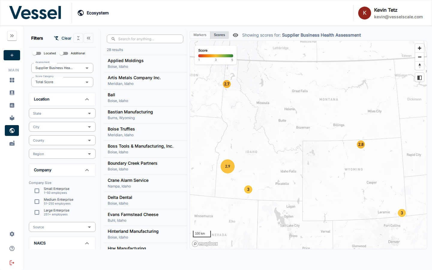
Scores View
The Scores view overlays assessment results as color-coded markers on the Ecosystem Map, letting you instantly see how accounts across your region performed on any assessment.
Enabling Scores View
First, select an Assessment in the Filters panel. Once an assessment is selected, a Markers / Scores toggle appears at the top of the map. Switch it to Scores to activate the color-coded view.
Reading the Map
The color scale runs from red (low score) through yellow to green (high score). The score range is shown in the legend on the map:
- Red zones indicate accounts with lower assessment scores
- Yellow zones indicate accounts in the mid-range
- Green zones indicate accounts with higher assessment scores
- Accounts with no score for the selected assessment are hidden from the map
Score Categories
When you select an assessment, the Score Category dropdown becomes available. This dropdown lets you switch between viewing different scoring metrics:
- Total Score — The overall assessment score across all categories (default)
- Individual Category Scores — Any scoring categories defined in the assessment
Each organization defines their own assessment categories. For example, an assessment might have categories like: - Financial Stability - Operational Excellence - Risk Management - Compliance
Viewing Different Score Categories
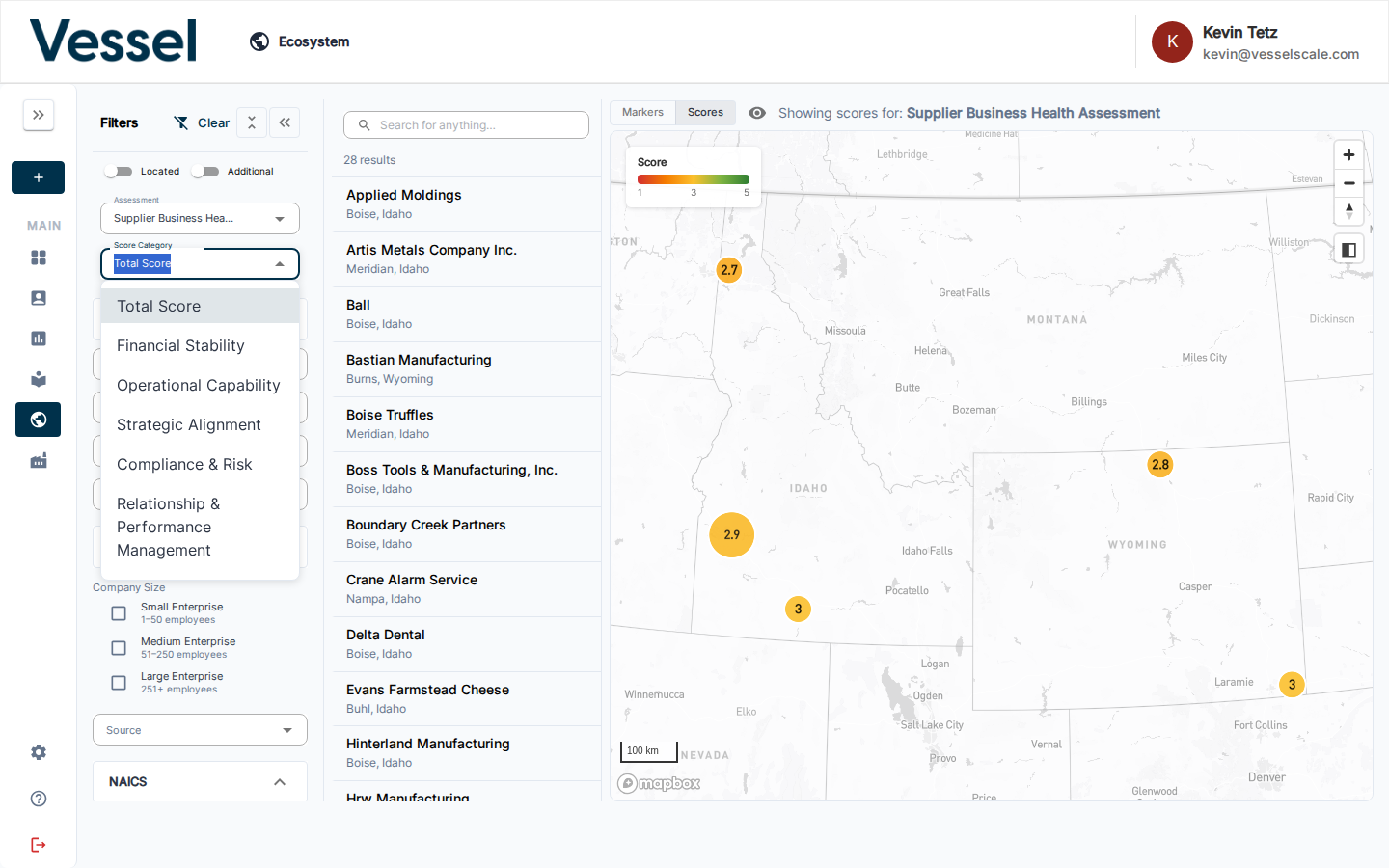
- Click the Score Category dropdown in the filters panel
- Select any category to switch the map visualization
- The markers update instantly to show scores for that specific category
Example: Financial Stability Category
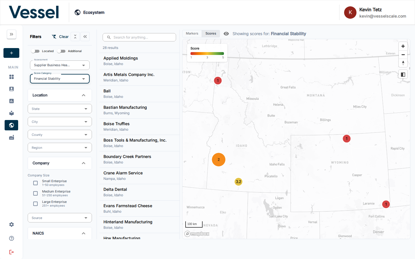
Here the map is showing scores specifically for the Financial Stability category. Notice how the distribution of colors changes — accounts that score high on overall resilience might score differently on specific categories.
Related
- Ecosystem Map — overview
- Filters — select an assessment and narrow down which accounts appear
- Account List & Details — click an account marker to view its details
- Assessments — manage the assessments whose scores can be visualized here