 ChatGPT
 Claude
 Gemini
 Perplexity
Editing Icons
Icons are used throughout your assessments to enhance visual representation and improve user experience. This guide explains how to select, customize, and manage icons for your assessment content.
Icon Picker Modal
The icon picker modal is used to select and customize icons for various assessment elements. When you click on an icon selector button, a modal window opens displaying available icons organized in a library.
Opening the Icon Picker
The icon picker modal can be accessed from:
- Assessment Editor: Click the icon button in the Assessment Details section
- Web Reports: Click the icon button when editing content blocks
- Assessment List (YAML): Click the edit icon button on an assessment row to change its icon
Icon Selection
The icon picker provides:
- Icon Library: 50+ Material Design business icons to choose from
- Search/Filter: Find icons quickly by name or category
- Color Picker: Select custom colors for your icons
- Style Options: Choose from multiple icon styles
- Default: Solid color icon
- Tinted: Icon with semi-transparent color overlay
- Inverted: White icon on colored background
- Outlined: Icon outline only
Icon Picker Overview
When you open the icon picker, you'll see a modal window displaying the full library of available icons:
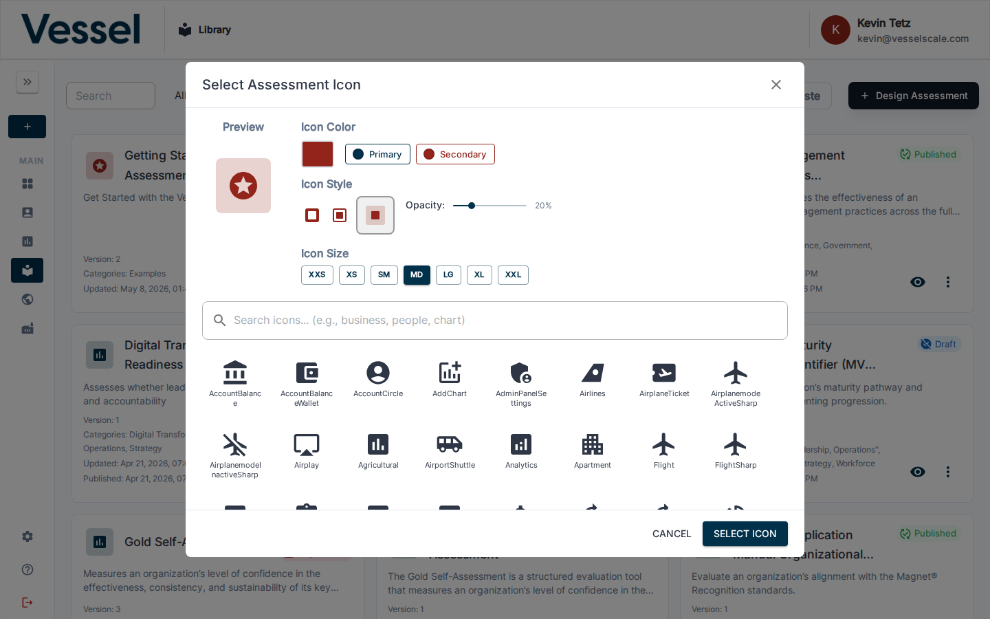
Browsing Icon Options
You can scroll through the icon library to find the perfect icon for your needs. The modal shows multiple icons organized in a grid:
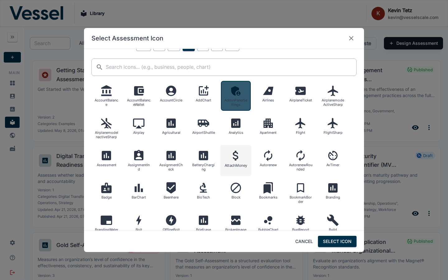
Customization Controls
The icon picker provides easy access to all customization options, including color selection, style choices, and other visual settings:
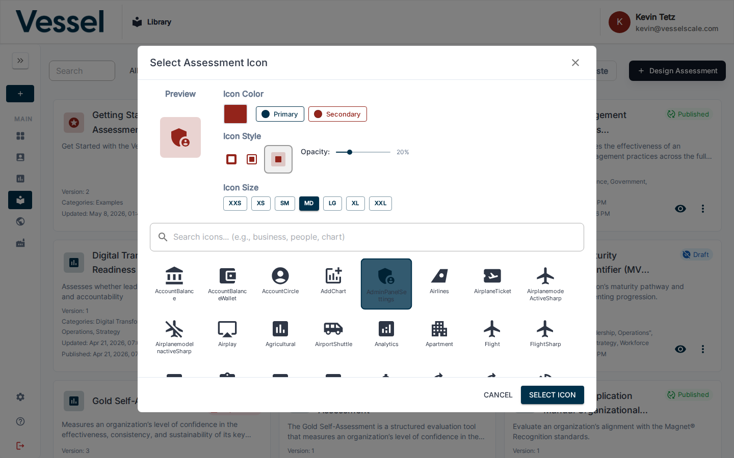
Customizing Icons
Once you've selected an icon, you can further customize it:
- Color: Choose from predefined colors or set a custom color using the color picker
- Size: Select from extra-small (xxs) to extra-large (xxl) sizes
- Style: Apply different visual styles as described above
- Icon Opacity: Fine-tune the transparency level (e.g., op80 for 80% opacity)
Icon Templates
For advanced use cases, you can use icon template variables in the format:
{{icon:library;iconName;color;style;size}}
Example: {{icon:business;Assessment;#1976d2;tinted;md}}
This allows you to embed icons dynamically in your content.
Best Practices
- Consistency: Use icons consistently throughout your assessment to maintain visual coherence
- Clarity: Ensure icons are clearly visible and easily distinguishable from one another
- Relevance: Match icon choices to the content they represent for better user understanding
- Accessibility: Select icon colors with sufficient contrast for visibility
- Responsiveness: Test icon appearance across different screen sizes to ensure they display correctly
- Branding: Align icon colors with your organization's brand colors for professional appearance
Common Icon Categories
The icon library includes icons for:
- Business and organization icons (business, corporate, office, etc.)
- Assessment and evaluation icons
- Financial and performance icons
- Operational and process icons
- Risk and compliance icons
- And many more...
Troubleshooting
Icon picker doesn't open: - Verify you have permission to edit the assessment or content block - Clear your browser cache and reload the page - Try a different browser to rule out compatibility issues
Icon colors don't display correctly: - Ensure your selected color has sufficient contrast with the background - Try selecting a different style (e.g., switch from "tinted" to "default") - Check that custom colors are entered in valid hex format (e.g., #1976d2)
Icon appears too small or too large: - Adjust the icon size setting in the picker - Consider your content layout and select an appropriate size - Test on different devices to ensure consistent appearance
Need More Help?
For additional support with editing icons or other library features, please refer to our Library Overview or contact our support team.